Whether you’re new to eCommerce or already a veteran, you may have the best products to sell, the best Shopify theme installed, the best marketing strategy, and your store is fully optimized for SEO and for conversion.
But do you know that most of visitors will quite your website if your store doesn’t provide enough information about your products and if it is crowded with content, images and videos?
Below are 10 of the most common eCommerce design mistakes that Shopify merchants make, as well as advice on how to avoid or fix them.
Table of contents
- 1- Huge amount of content
- 2- Non-compressed images and videos
- 3- Embedded text in images
- 4. Images ratio
- 5. Long product titles with short ones
- 6. Not enough spaces between sections
- 7. Blank spaces below the featured product image
- 8. Product thumbnails below the featured photo
- 9. Non-user friendly filter sidebar
- 10. Wrong images sizes on different devices
- Conclusion
1- Huge amount of content
We understand that you would like to showcase every perk of your business, and let the visitors know what they should chose your products over your competitors, but do you know that unlike single product stores, the most visited page in a store is the homepage?
With that being said, if your homepage size is huge, it will have 2 negative impacts :
1.1 – User Experience
If your homepage has lot of content, visitors may be confused, and they need to scroll a lot in order to read everything, they may not capt everything, mainly if you have lot of images, videos and text. And for mobile users, it could be a bit hard to navigate.
Solution suggestion : Use a header and small paragraph to let people know what your business is about, with 3 to 4 additional sections to showcase your best sellers, customers reviews, refund/exchange policy, … A page shouldn’t exceed 1mb in size, you can use a tool such as Pingdom to know your page size
1.2 – Site speed
Even if you have in hand the fastest Shopify theme, and have hired the most talented developer to sharpen your site speed, each new section on your homepage, each additional image and video will decrease the store speed, which will have a negative impact on user navigation mainly on mobile devices.
Best practice : In order not to negatively impact the site speed, avoid using sliders and carousels, instead, use Image with text and static featured collection or products.
2- Non-compressed images and videos
It is true that high quality images and videos are the first things that popup to the visitor’s eye, and the visitor can easily know what is your business about in just few seconds, but again, one of the most common eCommerce design mistakes we have seen on lot of Shopify stores, is the fact the images being used are not compressed, which means they are heavy, and slow down the page speed.
Solution : Use some online tool to compress your images and videos without impacting their quality.
3- Embedded text in images
Again, this is one of the most common eCommerce design mistakes, text into graphics or images, i.e. You create an image with text overlay on Canva or any other images tool, and you save it as a whole image.
3.1-Drawback for users
Since the text is embedded into the image, the text quality will decrease and will lost its high resolution on mobile devices and small screens.
3.2-Drawback for Search Engines
Putting text into images has significant drawbacks for SEO, because the image contains no real text, search engines such as Google, bing or Yahoo don’t have anything to index.
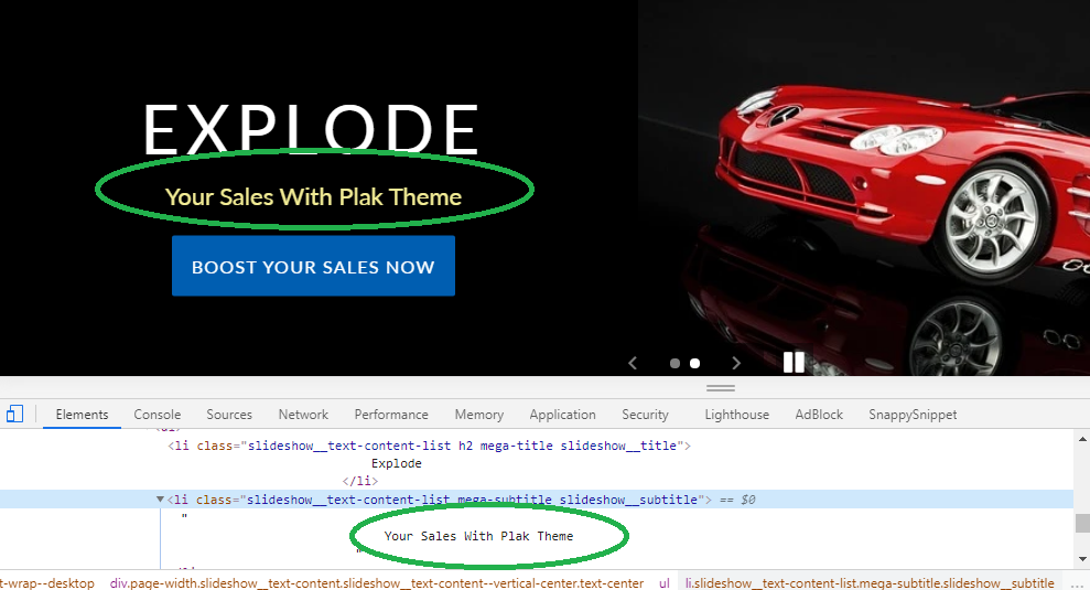
Solution : a Shopify theme like Plak, use an advanced and SEO friendly slider where the slider is divided into 2 aligned sections : one for the image and one for the text, so your text can preserve its high resolution quality and can be read by search engines
4. Images ratio
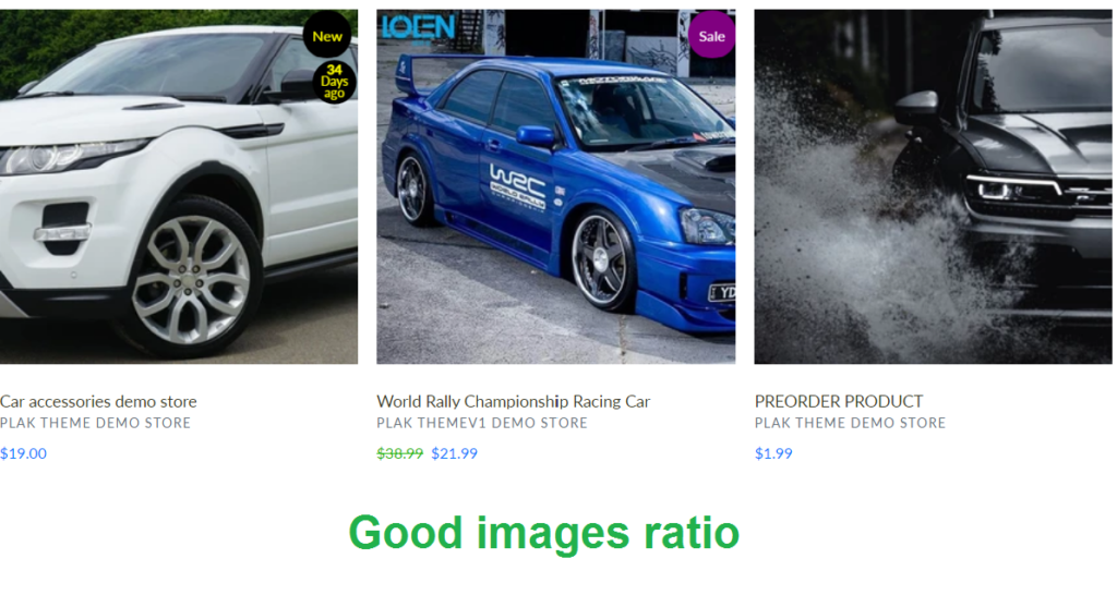
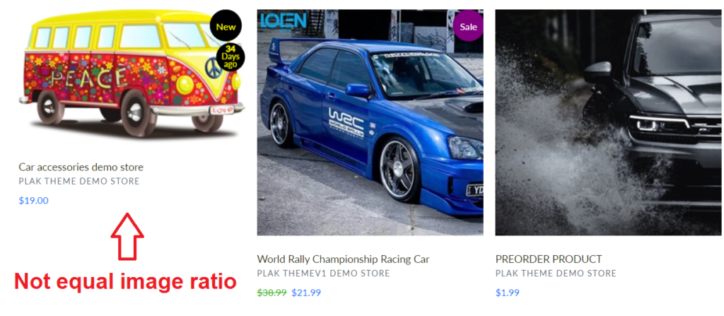
This is one of the most eCommerce design mistakes that impact the collection pages. Using different images ratio, will have a negative impact on the look of your store, mainly for collection pages, where the images container will look smaller or bigger than the rest of the featured images, and can also look bad when a user hover over the image, and the hovered image has a different ratio than the featured one.
Below is the good example of the featured products in a collection page when all of them have the same ratio
And below is an example when an image has a different ratio, I guess you knew which one is not well sized 🙂
5. Long product titles with short ones
Sometimes, you will need to have a long product title to better define the product, but again, this can have a bad look on the collection page if your other products have a short title.
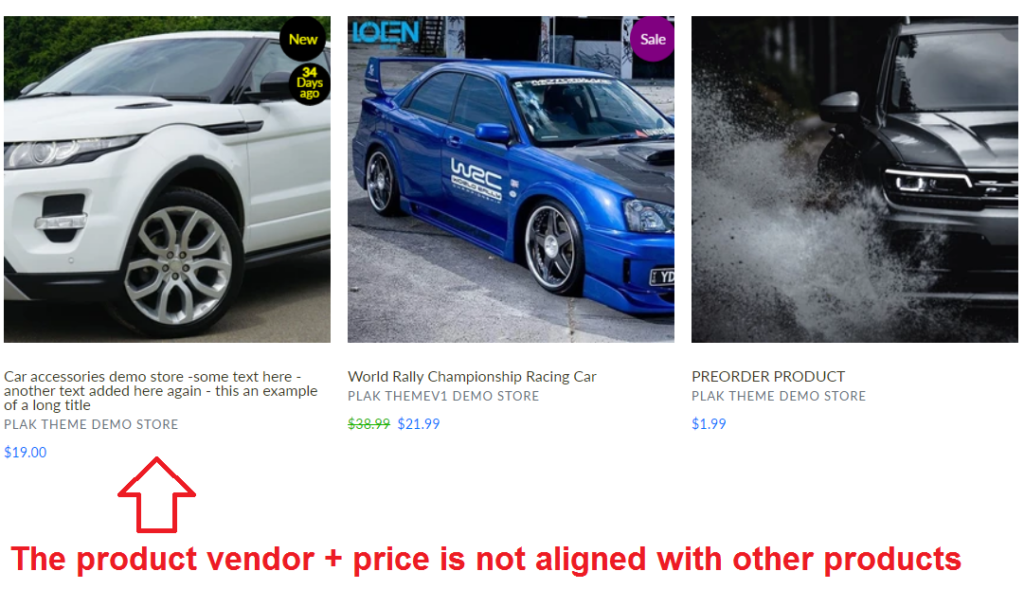
The featured product container have a fixed with, and since the product title is too big, you will have 2+ lines only for the product titles, which follows, like the product vendor and the product price will be pushed to the bottom, then an alignment issue will appear which will give a bad look for the collection page
What is the solution then ?
You have only 2 solutions for this issue
- Use the same number of character of your titles
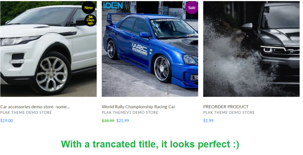
- Truncate the title if they exceed a number of characters, luckily on themes from Plak Theme are built with UX in mind, take a look at the example below, the first product in the left has a long title, and the truncate restriction has been applied in order to keep the alignment correct. If you don’t use a theme from Plak Theme, you need to hire a developer to apply this feature
6. Not enough spaces between sections
As stated in the first eCommerce design mistake regarding the huge amount of content, not having enough spaces between section will not let the visitor absorbs the content on the section being viewed.
Solution : Increase the spaces between section through custom coding or use the homepage dividers section, this section is available on themes from Plak Theme
7. Blank spaces below the featured product image
We know you can control the images quality, the products title and description content, but when it comes to the product page design, this largely belongs to theme you are using.
Many merchants don’t know the main difference between Free and paid themes, and among the differences that put paid themes on a head of Free ones, is that paid themes like Plak are designed in away to increase the User Experience.
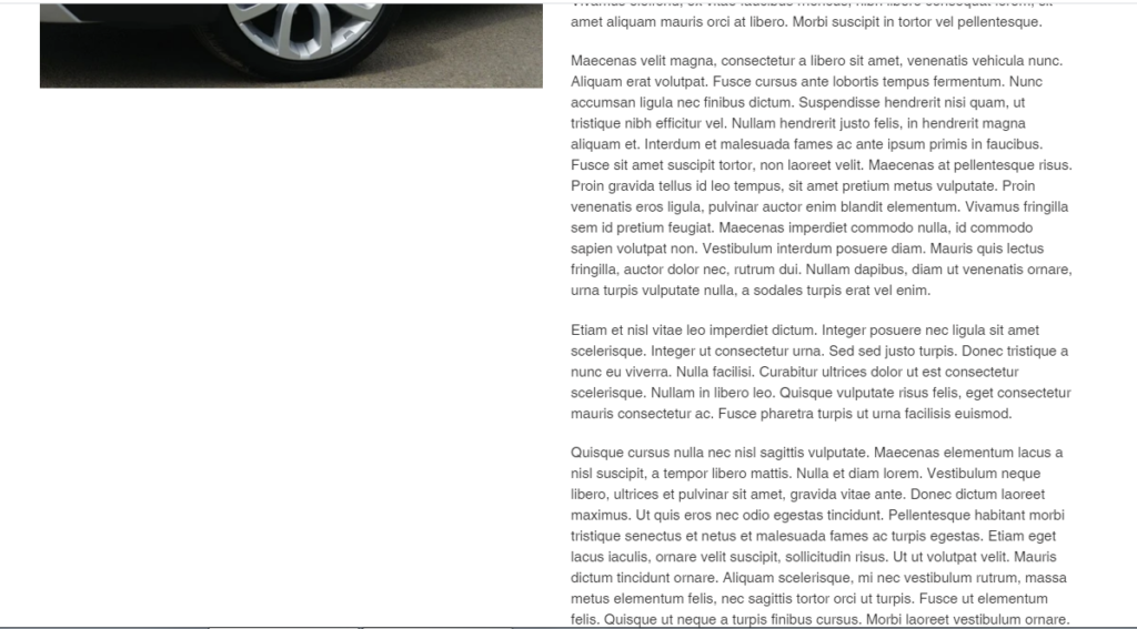
If you use a Free theme like Debut, and have a long product description, the visitors from desktop will have a blank space below the featured product image when scrolling down and up (screenshot below)
Solution?
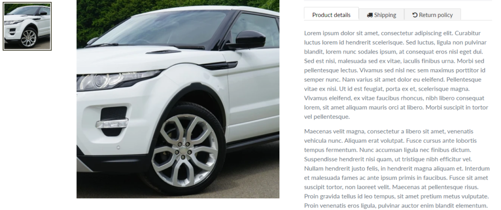
The featured product image must be sticky or fixed on scrolling, this way the visitors won’t see a blank space, and can easily read the product description while having an eye on the featured product image and the product thumbnails. (example from Plak theme product page below)
More than 40% of people are still using desktops or laptops to shop online. by not having a professional looking product page, could lost you 40% of potential customers
8. Product thumbnails below the featured photo
The product page is one of the most important pages in any eCommerce store, in fact this is where the visitor will either hits the Add to cart/buy it now button or will leave your site, so the design of the product page and its layout for both mobile and desktop is very important to increase the User Experience and the Conversion Rate by consequence.
One of the most common eCommerce design mistakes of the product page, is how the thumbnails are positioned along with the main product image.
Thumbnails too way below the main product image ?
If the product thumbnails are too way below the featured product image, the user must scroll down to click the on the desired thumbnail, then scroll up to see the larger photo, if the user would like to see another thumbnails, he needs to scroll down again, click and scroll up once more to see the details, this is hard, time consuming and the visitors will find it hard to see all the details mainly if you have lot of thumbnails.
Solution 1: Use the layout (thumbnails under the main image) only if your images have a ratio of the width longer than the height (ex: 2:1), this way the thumbnails will all appear under the main photo in a one view perspective, and also you need to have the thumbnails to be shown as a slider in order not to have them shown as blocks one below each others.
Solution 2: Use the layout (thumbnails nest to the main image), this recommended if your images ratio is (1:1 or 1:2), the height of the image is longer than the width, like for lingerie or fashion stores.
Solution 3: Use the layout (thumbnails above the product title)
Take a look at the below video to see he difference between a good product page layout and a bad one.
9. Non-user friendly filter sidebar
Are you a big brand or have you a large inventory ? You need then a good filter sidebar, but what if your filter sidebar is badly designed on both desktop and mobile devices ?
Mobile visitors occupy about 60% of the online users, and as a large business, if you don’t have an easy to use and user friendly filter sidebar on mobile, you are losing a lot of potential customers.
9.1 – Good filter sidebar must be
| Plak filter | Other themes filter | Consequence |
|---|---|---|
| ✓ The page doesn’t reload when selecting a filter. | X The page reloads when selecting a filter. | Increase the User Experience |
| ✓ The filter support Multi-tags, which means, it can be used like a sub-collection, sub-sub-collection, … | X The filter doesn’t support Multi-tags, which means, you can’t filter a size + color + brand +, … | Increase the User Experience |
| ✓ The Filter never shows (no products found) | X The Filter shows (no products found) if you select several things on the filter | Increase the User Experience |
| ✓ The filter is mobile friendly + you can show/hide some elements depending on the device, ex : you can add a large banner on desktop and hide it on mobile | X The filter is not mobile friendly, user must goes up the page to filter + you can’t show/hide some filters on different devices | Increase the User Experience |
| ✓ The filter doesn’t loop over all products, it filters only the viewed collection, customers will never be lost | X The filter loops over all products, this will increase the return rate, as some people would buy a product which was not in their viewed collection | Decrease the return rate |
| ✓ SEO friendly | X Not SEO friendly (there is no link attributes to the links) when you hover over a filter the title link doesn’t appear | Increase SEO |
| ✓ Color swatches uses the CSS color automatically (no hassle for merchants + no damage for site speed) | X Color watches use png images (the more you add colors the slower the page will be) + it is a hassle for merchants to add colors as images one by one | Optimize the collection page speed |
9.2 – Filter sidebar on mobile
You may not know it yet, but you may leaving money on the table by simply using a wrong theme, if you have a filter sidebar, go to your collection page from a mobile device and try to imitate a user who first lands on your store and who tries to filter the products on your collection page.
Most of Shopify themes are not well designed, the user must click the filter button to filter, then scroll all the filtered products, if he would like to sub-filter or filter again, he needs to go to the top of the page to use the filter button again, … this repeated process has negative impact to the User Experience.
The solution : Use a sticky filter button on mobile devices, this way the button always appear to the user and click filter and filter again by a simple click without the need to scroll up and down many times. Example from Plak Theme collection page
10. Wrong images sizes on different devices
We know that images are one of the greatest ways to increase the CTR (Click-Through Rate), professional bloggers use long images on the blog article sidebar to incite visitors to click the image to redirect them to their best sellers, or their best articles.
The use of a long image such as 300×600 or even 300×900 will be eye-catching for the visitors on desktop devices, but the issue here, is if the user is using a mobile device, the image on that mobile device will look too way high, you need then to use a smaller image for mobiles and a long one for desktop only.
If your theme doesn’t support the filter depending on the device being used, you will need to hire a developer to make different image for each device, but luckily, this feature is built-in the themes from Plak Theme, you can hide/show features depending on the device, like the filter sidebar on collection pages or the sidebar on blog pages, take a look at the video below, or check directly this blog demo, on desktop you will a long 300×900 image on desktop and a different photo on mobile sized to fit small screens.
Conclusion
We have highlighted the top 10 eCommerce design mistakes that we have seen on some Shopify merchants. If you believe there are other important design mistakes we can add to this article, feel free to leave us a comment below.
Scrowp is a web design that helped hundreds of Shopify merchants in their store design
[yasr_visitor_votes]
